May 19th, 2016 by Jeff Meyer
There are many steps to analyzing a dataset. One of the first steps is to create tables and graphs of your variables in order to understand what is behind the thousands of numbers on your screen. But the type of table and graph you create depends upon the type of variable you are looking at.
There certainly isn’t much point in running a frequency table for a continuous variable with hundreds of unique observations. Creating a boxplot to look for outliers doesn’t make much sense if the variable is categorical. Creating a histogram for a dummy variable would be senseless as well.
How should you start this process? Should you create a spreadsheet listing all the names of the variables and list what type of variable they are? Should you paste the names into a Word document?
In this free webinar with Stata expert Jeff Meyer, you will discover the code to quickly determine the type of every variable in a dataset. By simply pressing the execute button on a do-file you will observe Stata placing each variable in a group (the macro) based on the type of variable it is.
You will watch, through the use of loops, Stata create the proper table and graph for each type of variable in a matter of minutes and output the data into a pdf file for future viewing. You will also receive the code to recreate and practice what you’ve learned.
**
Title: Improving Your Productivity by Unlocking the Power of Stata’s Macros and Loops
Date: Thurs, May 26, 2016
Time: 1-2 pm EDT
Presenter: Jeff Meyer
This webinar has already taken place. Please sign up below to get access to the video recording.
Jeff Meyer is a statistical consultant with The Analysis Factor, a stats mentor for Statistically Speaking membership, and a workshop instructor. Read more about Jeff here.
May 18th, 2016 by Jeff Meyer

In a previous post , Using the Same Sample for Different Models in Stata, we examined how to use the same sample when comparing regression models. Using different samples in our models could lead to erroneous conclusions when interpreting results.
But excluding observations can also result in inaccurate results.
The coefficient for the variable “frequent religious attendance” was negative 58 in model 3 (more…)
January 5th, 2016 by Jeff Meyer
Fortunately there are some really, really smart people who use Stata. Yes I know, there are really, really smart people that use SAS and SPSS as well.
But unlike SAS and SPSS users, Stata users benefit from the contributions made by really, really smart people. How so? Is Stata an “open source” software package?
Technically a commercial software package (software you have to pay for) cannot be open source. Based on that definition Stata, SPSS and SAS are not open source. R is open source.
But, because I have a Stata license (once you have it, it never expires) I think of Stata as being open source. This is because Stata allows members of the Stata community to share their expertise.
There are countless commands written by very, very smart non-Stata employees that are available to all Stata users.
Practically all of these commands, which are free, can be downloaded from the SSC (Statistical Software Components) archive. The SSC archive is maintained by the Boston College Department of Economics. The website is: https://ideas.repec.org/s/boc/bocode.html
There are over three thousand commands available for downloading. Below I have highlighted three of the 185 that I have downloaded.
1. coefplot is a command written by Ben Jann of the Institute of Sociology, University of Bern, Bern, Switzerland. This command allows you to plot results from estimation commands.
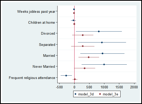
In a recent post on diagnosing missing data, I ran two models comparing the observations that reported income versus the observations that did not report income, models 3d and 3e.
Using the coefplot command I can graphically compare the coefficients and confidence intervals for each independent variable used in the models.
The code and graph are:
coefplot model_3d model_3e, drop(_cons) xline(0)
Including the code xline(0) creates a vertical line at zero which quickly allows me to determine whether a confidence interval spans both positive and negative territory.

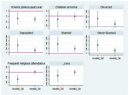
I can also separate the predictor variables into individual graphs:
coefplot model_3d || model_3e, yline(0) bycoefs vertical byopts(yrescale) ylabel(, labsize(vsmall))

2. Nicholas Cox of Durham University and Gary Longton of the Fred Hutchinson Cancer Research Center created the command distinct. This command generates a table with the count of distinct observations for each variable in the data set.
When getting to know a data set, it can be helpful to search for potential indicator, categorical and continuous variables. The distinct command along with its min(#) and max(#) options allows an easy search for variables that fit into these categories.
For example, to create a table of all variables with three to seven distinct observations I use the following code:
distinct, min(3) max(7)
In addition, the command generates the scalar r(ndistinct). In the workshop Managing Data and Optimizing Output in Stata, we used this scalar within a loop to create macros for continuous, categorical and indicator variables.
3. In a data set it is not uncommon to have outliers. There are primarily three options for dealing with outliers. We can keep them as they are, winsorize the observations (change their values), or delete them. Note, winsorizing and deleting observations can introduce statistical bias.
If you choose to winsorize your data I suggest you check out the command winsor2. This was created by Lian Yujun of Sun Yat-Sen University, China. This command incorporates coding from the command winsor created by Nicholas Cox and Judson Caskey.
The command creates a new variable, adding a suffix “_w” to the original variable’s name. The default setting changes observations whose values are less than the 1st percentile to the 1 percentile. Values greater than the 99th percentile are changed to equal the 99th percentile. Example:
winsor2 salary (makes changes at the 1st and 99th percentile for the variable “salary”)
The user has the option to change the values to the percentile of their choice.
winsor2 salary, cuts(0.5 99.5) (makes changes at the 0.5st and 99.5th percentile)
To add these three commands to your Stata software execute the following code and click on the links to download the commands:
findit coefplot
findit distinct
findit winsor2
As shown in the December, 2015 free webinar “Stata’s Bountiful Help Resources”, you can also explore all the add-on commands via Stata’s “Help” menu. Go to “Help” => “SJ and User Written Commands” to explore.
Jeff Meyer is a statistical consultant with The Analysis Factor, a stats mentor for Statistically Speaking membership, and a workshop instructor. Read more about Jeff here.
January 4th, 2016 by Jeff Meyer
In the last post, we examined how to use the same sample when running a set of regression models with different predictors.
Adding a predictor with missing data causes cases that had been included in previous models to be dropped from the new model.
Using different samples in different models can lead to very different conclusions when interpreting results.
Let’s look at how to investigate the effect of the missing data on the regression models in Stata.
The coefficient for the variable “frequent religious attendance” was negative 58 in model 3 and then rose to a positive 6 in model 4 when income was included. Results (more…)
November 24th, 2015 by Jeff Meyer

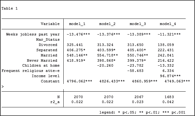
In my last article, Hierarchical Regression in Stata: An Easy Method to Compare Model Results, I presented the following table which examined the impact several predictors have on one’ mental health.

At the bottom of the table is the number of observations (N) contained within each sample.
The sample sizes are quite large. Does it really matter that they are different? The answer is absolutely yes.
Fortunately in Stata it is not a difficult process to use the same sample for all four models shown above.
Some background info:
As I have mentioned previously, Stata stores results in temp files. You don’t have to do anything to cause Stata to store these results, but if you’d like to use them, you need to know what they’re called.
To see what is stored after an estimation command, use the following code:
ereturn list
After a summary command:
return list
One of the stored results after an estimation command is the function e(sample). e(sample) returns a one column matrix. If an observation is used in the estimation command it will have a value of 1 in this matrix. If it is not used it will have a value of 0.
Remember that the “stored” results are in temp files. They will disappear the next time you run another estimation command.
The Steps
So how do I use the same sample for all my models? Follow these steps.
Using the regression example on mental health I determine which model has the fewest observations. In this case it was model four.
I rerun the model:
regress MCS weeks_unemployed i.marital_status kids_in_house religious_attend income
Next I use the generate command to create a new variable whose value is 1 if the observation was in the model and 0 if the observation was not. I will name the new variable “in_model_4”.
gen in_model_4 = e(sample)
Now I will re-run my four regressions and include only the observations that were used in model 4. I will store the models using different names so that I can compare them to the original models.
My commands to run the models are:
regress MCS weeks_unemployed i.marital_status if in_model_4==1
estimates store model_1a
regress MCS weeks_unemployed i.marital_status kids_in_house if in_model_4==1
estimates store model_2a
regress MCS weeks_unemployed i.marital_status kids_in_house religious_attend if in_model_4==1
estimates store model_3a
regress MCS weeks_unemployed i.marital_status kids_in_house religious_attend income if in_model_4==1
estimates store model_4a
Note: I could use the code if in_model_4 instead of if in_model_4==1. Stata interprets dummy variables as 0 = false, 1 = true.
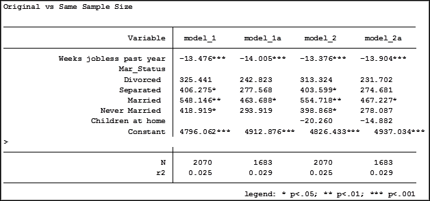
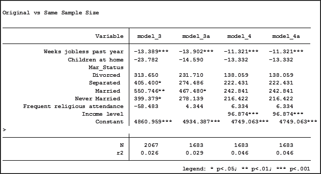
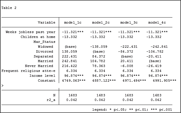
Here are the results comparing the original models (eg. Model_1) versus the models using the same sample (eg. Model_1a):


Comparing the original models 3 and 4 one would have assumed that the predictor variable “Income level” significantly impacted the coefficient of “Frequent religious attendance”. Its coefficient changed from -58.48 in model 3 to 6.33 in model 4.
That would have been the wrong assumption. That change is coefficient was not so much about any effect of the variable itself, but about the way it causes the sample to change via listwise deletion. Using the same sample, the change in the coefficient between the two models is very small, moving from 4 to 6.
Jeff Meyer is a statistical consultant with The Analysis Factor, a stats mentor for Statistically Speaking membership, and a workshop instructor. Read more about Jeff here.
November 17th, 2015 by Jeff Meyer

An “estimation command” in Stata is a generic term used for a command that runs a statistical model. Examples are regress, ANOVA, Poisson, logit, and mixed.
Stata has more than 100 estimation commands.
Creating the “best” model requires trying alternative models. There are a number of different model building approaches, but regardless of the strategy you take, you’re going to need to compare them.
Running all these models can generate a fair amount of output to compare and contrast. How can you view and keep track of all of the results?
You could scroll through the results window on your screen. But this method makes it difficult to compare differences.
You could copy and paste the results into a Word document or spreadsheet. Or better yet use the “esttab” command to output your results. But both of these require a number of time consuming steps.
But Stata makes it easy: my suggestion is to use the post-estimation command “estimates”.
What is a post-estimation command? A post-estimation command analyzes the stored results of an estimation command (regress, ANOVA, etc).
As long as you give each model a different name you can store countless results (Stata stores the results as temp files). You can then use post-estimation commands to dig deeper into the results of that specific estimation.
Here is an example. I will run four regression models to examine the impact several factors have on one’s mental health (Mental Composite Score). I will then store the results of each one.
regress MCS weeks_unemployed i.marital_status
estimates store model_1
regress MCS weeks_unemployed i.marital_status kids_in_house
estimates store model_2
regress MCS weeks_unemployed i.marital_status kids_in_house religious_attend
estimates store model_3
regress MCS weeks_unemployed i.marital_status kids_in_house religious_attend income
estimates store model_4
To view the results of the four models in one table my code can be as simple as:
estimates table model_1 model_2 model_3 model_4
But I want to format it so I use the following:
estimates table model_1 model_2 model_3 model_4, varlabel varwidth(25) b(%6.3f) /// star(0.05 0.01 0.001) stats(N r2_a)
Here are my results:

My base category for marital status was “widowed”. Is “widowed” the base category I want to use in my final analysis? I can easily re-run model 4, using a different reference group base category each time.
Putting the results into one table will make it easier for me to determine which category to use as the base.

Note in table 1 the size of the samples have changed from model 2 (2,070) to model 3 (2,067) to model 4 (1,682). In the next article we will explore how to use post-estimation data to use the same sample for each model.
Jeff Meyer is a statistical consultant with The Analysis Factor, a stats mentor for Statistically Speaking membership, and a workshop instructor. Read more about Jeff here.


