In a statistical model–any statistical model–there is generally one way that a predictor X and a response Y can relate:
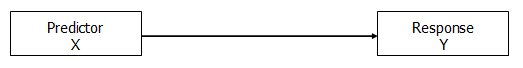
This relationship can take on different forms, of course, like a line or a curve, but there’s really only one relationship here to measure.
Usually the point is to model the predictive or explanatory ability, the effect, of X on Y.
In other words, there is a clear response variable*, although not necessarily a causal relationship. We could have switched the direction of the arrow to indicate that Y predicts X. Or used a two-headed arrow to show a correlation, with no direction, but that’s a whole other story.
For our purposes, Y is the response variable and X the predictor.
But a third variable–another predictor–can relate to X and Y in a number of different ways. How this predictor relates to X and Y changes how we interpret the relationship between X and Y. (more…)
Graphing predicted values from a regression model or means from an ANOVA makes interpretation of results much easier.
Every statistical software will graph predicted values for you. But the more complicated your model, the harder it can be to get the graph you want in the format you want.
Excel isn’t all that useful for estimating the statistics, but it has some very nice features that are useful for doing data analysis, one of which is graphing.
In this webinar, I will demonstrate how to calculate predicted means from a linear and a logistic regression model, then graph them. It will be particularly useful to you if you don’t have a very clear sense of where those predicted values come from.
Note: This training is an exclusive benefit to members of the Statistically Speaking Membership Program and part of the Stat’s Amore Trainings Series. Each Stat’s Amore Training is approximately 90 minutes long.
About the Instructor

Karen Grace-Martin helps statistics practitioners gain an intuitive understanding of how statistics is applied to real data in research studies.
She has guided and trained researchers through their statistical analysis for over 15 years as a statistical consultant at Cornell University and through The Analysis Factor. She has master’s degrees in both applied statistics and social psychology and is an expert in SPSS and SAS.
Not a Member Yet?
It’s never too early to set yourself up for successful analysis with support and training from expert statisticians.
Just head over and sign up for Statistically Speaking.
You'll get access to this training webinar, 130+ other stats trainings, a pathway to work through the trainings that you need — plus the expert guidance you need to build statistical skill with live Q&A sessions and an ask-a-mentor forum.
In Part 3 we used the lm() command to perform least squares regressions. In Part 4 we will look at more advanced aspects of regression models and see what R has to offer.
One way of checking for non-linearity in your data is to fit a polynomial model and check whether the polynomial model fits the data better than a linear model. However, you may also wish to fit a quadratic or higher model because you have reason to believe that the relationship between the variables is inherently polynomial in nature. Let’s see how to fit a quadratic model in R.
We will use a data set of counts of a variable that is decreasing over time. Cut and paste the following data into your R workspace.
A <- structure(list(Time = c(0, 1, 2, 4, 6, 8, 9, 10, 11, 12, 13,
14, 15, 16, 18, 19, 20, 21, 22, 24, 25, 26, 27, 28, 29, 30),
Counts = c(126.6, 101.8, 71.6, 101.6, 68.1, 62.9, 45.5, 41.9,
46.3, 34.1, 38.2, 41.7, 24.7, 41.5, 36.6, 19.6,
22.8, 29.6, 23.5, 15.3, 13.4, 26.8, 9.8, 18.8, 25.9, 19.3)), .Names = c("Time", "Counts"),
row.names = c(1L, 2L, 3L, 5L, 7L, 9L, 10L, 11L, 12L, 13L, 14L, 15L, 16L, 17L, 19L, 20L, 21L, 22L, 23L, 25L, 26L, 27L, 28L, 29L, 30L, 31L),
class = "data.frame")
Let’s attach the entire dataset so that we can refer to all variables directly by name.
attach(A)
names(A)
First, let’s set up a linear model, though really we should plot first and only then perform the regression.
linear.model <-lm(Counts ~ Time)
We now obtain detailed information on our regression through the summary() command.
summary(linear.model)
Call:
lm(formula = Counts ~ Time)

Residuals:
   Min     1Q Median     3Q     Max
-20.084 -9.875 -1.882   8.494 39.445

Coefficients:
           Estimate Std. Error t value Pr(>|t|)
(Intercept) 87.1550     6.0186 14.481 2.33e-13 ***
Time         -2.8247     0.3318 -8.513 1.03e-08 ***
---
Signif. codes: 0 ‘***’ 0.001 ‘**’ 0.01 ‘*’ 0.05 ‘.’ 0.1 ‘ ’ 1

Residual standard error: 15.16 on 24 degrees of freedom
Multiple R-squared: 0.7512,   Adjusted R-squared: 0.7408
F-statistic: 72.47 on 1 and 24 DF, p-value: 1.033e-08
The model explains over 74% of the variance and has highly significant coefficients for the intercept and the independent variable and also a highly significant overall model p-value. However, let’s plot the counts over time and superpose our linear model.
plot(Time, Counts, pch=16, ylab = "Counts ", cex.lab = 1.3, col = "red" )

abline(lm(Counts ~ Time), col = "blue")
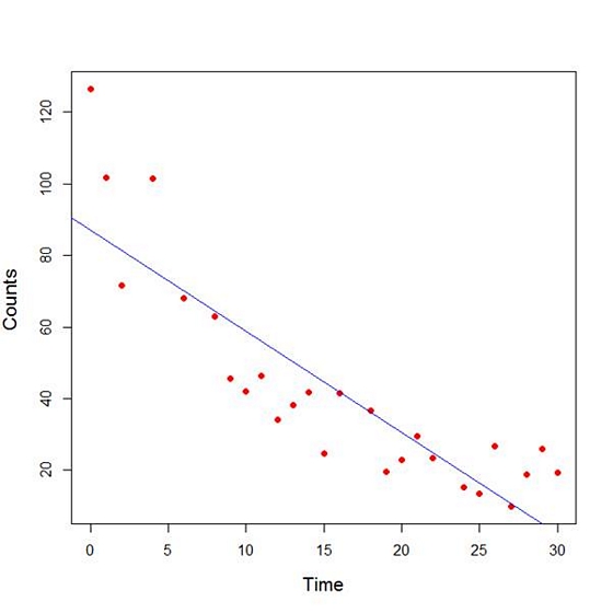
Here the syntax cex.lab = 1.3 produced axis labels of a nice size.
The model looks good, but we can see that the plot has curvature that is not explained well by a linear model. Now we fit a model that is quadratic in time. We create a variable called Time2 which is the square of the variable Time.
Time2 <- Time^2
quadratic.model <-lm(Counts ~ Time + Time2)
Note the syntax involved in fitting a linear model with two or more predictors. We include each predictor and put a plus sign between them.
summary(quadratic.model)
Call:
lm(formula = Counts ~ Time + Time2)
Residuals:
     Min       1Q   Median       3Q     Max
-24.2649 -4.9206 -0.9519   5.5860 18.7728

Coefficients:
             Estimate Std. Error t value Pr(>|t|)
(Intercept) 110.10749   5.48026 20.092 4.38e-16 ***
Time         -7.42253   0.80583 -9.211 3.52e-09 ***
Time2         0.15061   0.02545   5.917 4.95e-06 ***
---
Signif. codes: 0 ‘***’ 0.001 ‘**’ 0.01 ‘*’ 0.05 ‘.’ 0.1 ‘ ’ 1

Residual standard error: 9.754 on 23 degrees of freedom
Multiple R-squared: 0.9014,   Adjusted R-squared: 0.8928
F-statistic: 105.1 on 2 and 23 DF, p-value: 2.701e-12
Our quadratic model is essentially a linear model in two variables, one of which is the square of the other. We see that however good the linear model was, a quadratic model performs even better, explaining an additional 15% of the variance. Now let’s plot the quadratic model by setting up a grid of time values running from 0 to 30 seconds in increments of 0.1s.
timevalues <- seq(0, 30, 0.1)
predictedcounts <- predict(quadratic.model,list(Time=timevalues, Time2=timevalues^2))
plot(Time, Counts, pch=16, xlab = "Time (s)", ylab = "Counts", cex.lab = 1.3, col = "blue")
Now we include the quadratic model to the plot using the lines() command.
lines(timevalues, predictedcounts, col = "darkgreen", lwd = 3)
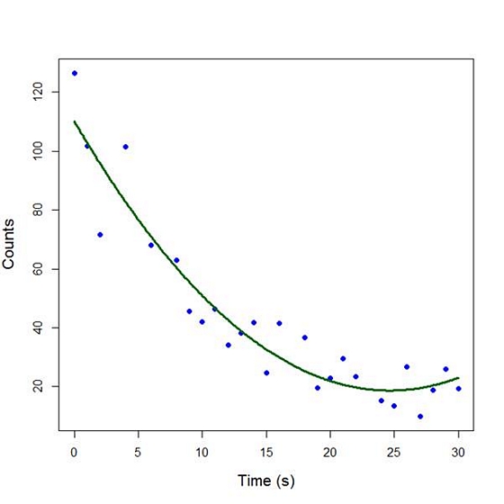
The quadratic model appears to fit the data better than the linear model. We will look again at fitting curved models in our next blog post.
About the Author: David Lillis has taught R to many researchers and statisticians. His company, Sigma Statistics and Research Limited, provides both on-line instruction and face-to-face workshops on R, and coding services in R. David holds a doctorate in applied statistics.
See our full R Tutorial Series and other blog posts regarding R programming.
Linear, Logistic, Tobit, Cox, Poisson, Zero Inflated… The list of regression models goes on and on before you even get to things like ANCOVA or Linear Mixed Models.
In this webinar, we will explore types of regression models, how they differ, how they’re the same, and most importantly, when to use each one.
Note: This training is an exclusive benefit to members of the Statistically Speaking Membership Program and part of the Stat’s Amore Trainings Series. Each Stat’s Amore Training is approximately 90 minutes long.
About the Instructor
Karen Grace-Martin helps statistics practitioners gain an intuitive understanding of how statistics is applied to real data in research studies.
She has guided and trained researchers through their statistical analysis for over 15 years as a statistical consultant at Cornell University and through The Analysis Factor. She has master’s degrees in both applied statistics and social psychology and is an expert in SPSS and SAS.
Not a Member Yet?
It’s never too early to set yourself up for successful analysis with support and training from expert statisticians.
Just head over and sign up for Statistically Speaking.
You'll get access to this training webinar, 130+ other stats trainings, a pathway to work through the trainings that you need — plus the expert guidance you need to build statistical skill with live Q&A sessions and an ask-a-mentor forum.
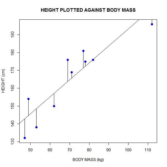
In Part 2 of this series, we created two variables and used the lm() command to perform a least squares regression on them, treating one of them as the dependent variable and the other as the independent variable. Here they are again.
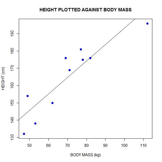
height = c(176, 154, 138, 196, 132, 176, 181, 169, 150, 175)
bodymass = c(82, 49, 53, 112, 47, 69, 77, 71, 62, 78)
Today we learn how to obtain useful diagnostic information about a regression model and then how to draw residuals on a plot. As before, we perform the regression.
lm(height ~ bodymass)
Call:
lm(formula = height ~ bodymass)
Coefficients:
(Intercept) bodymass
98.0054 0.9528
Now let’s find out more about the regression. First, let’s store the regression model as an object called mod and then use the summary() command to learn about the regression.
mod <- lm(height ~ bodymass)
summary(mod)
Here is what R gives you.
Call:
lm(formula = height ~ bodymass)
Residuals:
Min 1Q Median 3Q Max
-10.786 -8.307 1.272 7.818 12.253
Coefficients:
Estimate Std. Error t value Pr(>|t|)
(Intercept) 98.0054 11.7053 8.373 3.14e-05 ***
bodymass 0.9528 0.1618 5.889 0.000366 ***
Signif. codes: 0 ‘***’ 0.001 ‘**’ 0.01 ‘*’ 0.05 ‘.’ 0.1 ‘ ’ 1
Residual standard error: 9.358 on 8 degrees of freedom
Multiple R-squared: 0.8126, Adjusted R-squared: 0.7891
F-statistic: 34.68 on 1 and 8 DF, p-value: 0.0003662
R has given you a great deal of diagnostic information about the regression. The most useful of this information are the coefficients themselves, the Adjusted R-squared, the F-statistic and the p-value for the model.
Now let’s use R’s predict() command to create a vector of fitted values.
regmodel <- predict(lm(height ~ bodymass))
regmodel
Here are the fitted values:
1 2 3 4 5 6 7 8 9 10
176.1334 144.6916 148.5027 204.7167 142.7861 163.7472 171.3695 165.6528 157.0778 172.3222
Now let’s plot the data and regression line again.
plot(bodymass, height, pch = 16, cex = 1.3, col = "blue", main = "HEIGHT PLOTTED AGAINST BODY MASS", xlab = "BODY MASS (kg)", ylab = "HEIGHT (cm)")
abline(lm(height ~ bodymass))
We can plot the residuals using R’s for loop and a subscript k that runs from 1 to the number of data points. We know that there are 10 data points, but if we do not know the number of data we can find it using the length() command on either the height or body mass variable.
npoints <- length(height)

npoints
[1] 10
Now let’s implement the loop and draw the residuals (the differences between the observed data and the corresponding fitted values) using the lines() command. Note the syntax we use to draw in the residuals.
for (k in 1: npoints) lines(c(bodymass[k], bodymass[k]), c(height[k], regmodel[k]))
Here is our plot, including the residuals.
In part 4 we will look at more advanced aspects of regression models and see what R has to offer.
About the Author: David Lillis has taught R to many researchers and statisticians. His company, Sigma Statistics and Research Limited, provides both on-line instruction and face-to-face workshops on R, and coding services in R. David holds a doctorate in applied statistics.
See our full R Tutorial Series and other blog posts regarding R programming.