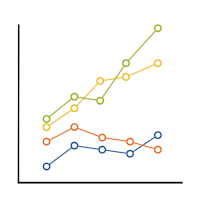
When I was in graduate school, stat professors would say “ANOVA is just a special case of linear regression.” But they never explained why.
And I couldn’t figure it out.
The model notation is different.
The output looks different.
The vocabulary is different.
The focus of what we’re testing is completely different. How can they be the same model?
(more…)
 As mixed models are becoming more widespread, there is a lot of confusion about when to use these more flexible but complicated models and when to use the much simpler and easier-to-understand repeated measures ANOVA.
One thing that makes the decision harder is sometimes the results are exactly the same from the two models and sometimes the results are (more…)
Most analysts’ primary focus is to check the distributional assumptions with regards to residuals. They must be independent and identically distributed (i.i.d.) with a mean of zero and constant variance.
Residuals can also give us insight into the quality of our models.
In this webinar, we’ll review and compare what residuals are in linear regression, ANOVA, and generalized linear models. Jeff will cover:
- Which residuals — standardized, studentized, Pearson, deviance, etc. — we use and why
- How to determine if distributional assumptions have been met
- How to use graphs to discover issues like non-linearity, omitted variables, and heteroskedasticity
Knowing how to piece this information together will improve your statistical modeling skills.
Note: This training is an exclusive benefit to members of the Statistically Speaking Membership Program and part of the Stat’s Amore Trainings Series. Each Stat’s Amore Training is approximately 90 minutes long.
(more…)
In the past few months, I’ve gotten the same question from a few clients about using linear mixed models for repeated measures data. They want to take advantage of its ability to give unbiased results in the presence of missing data. In each case the study has two groups complete a pre-test and a post-test measure. Both of these have a lot of missing data.
The research question is whether the groups have different improvements in the dependent variable from pre to post test.
As a typical example, say you have a study with 160 participants.
90 of them completed both the pre and the post test.
Another 48 completed only the pretest and 22 completed only the post-test.
Repeated Measures ANOVA will deal with the missing data through listwise deletion. That means keeping only the 90 people with complete data. This causes problems with both power and bias, but bias is the bigger issue.
Another alternative is to use a Linear Mixed Model, which will use the full data set. This is an advantage, but it’s not as big of an advantage in this design as in other studies.
The mixed model will retain the 70 people who have data for only one time point. It will use the 48 people with pretest-only data along with the 90 people with full data to estimate the pretest mean.
Likewise, it will use the 22 people with posttest-only data along with the 90 people with full data to estimate the post-test mean.
If the data are missing at random, this will give you unbiased estimates of each of these means.
But most of the time in Pre-Post studies, the interest is in the change from pre to post across groups.
The difference in means from pre to post will be calculated based on the estimates at each time point. But the degrees of freedom for the difference will be based only on the number of subjects who have data at both time points.
So with only two time points, if the people with one time point are no different from those with full data (creating no bias), you’re not gaining anything by keeping those 72 people in the analysis.
Compare this to a study I also saw in consulting with 5 time points. Nearly all the participants had 4 out of the 5 observations. The missing data was pretty random–some participants missed time 1, others, time 4, etc. Only 6 people out of 150 had full data. Listwise deletion created a nightmare, leaving only 6 people in the data set.
Each person contributed data to 4 means, so each mean had a pretty reasonable sample size. Since the missingness was random, each mean was unbiased. Each subject fully contributed data and df to many of the mean comparisons.
With more than 2 time points and data that are missing at random, each subject can contribute to some change measurements. Keep that in mind the next time you design a study.
If you have significant a significant interaction effect and non-significant main effects, would you interpret the interaction effect?
It’s a question I get pretty often, and it’s a more straightforward answer than most.
(more…)
In this follow-up to December’s webinar, we’ll finish up our discussion of interactions.
There is something about interactions that is incredibly confusing.
An interaction between two predictor variables means that one predictor variable affects a third variable differently at different values of the other predictor.
How you understand that interaction depends on many things, including:
- Whether one, or both, of the predictor variables is categorical or numerical
- How each of those variables is coded (specifically, whether each categorical variable is dummy or effect coded and whether numerical variables are centered)
- Whether it’s a two-way or three-way interaction
- Whether there is a directionality to the interaction (moderation) or not
Sometimes you need to get pretty sophisticated in your coding, in the output you ask for, and in writing out regression equations.
In this webinar, we’ll examine how to put together and break apart output to understand what your interaction is telling you.
Note: This training is an exclusive benefit to members of the Statistically Speaking Membership Program and part of the Stat’s Amore Trainings Series. Each Stat’s Amore Training is approximately 90 minutes long.
About the Instructor

Karen Grace-Martin helps statistics practitioners gain an intuitive understanding of how statistics is applied to real data in research studies.
She has guided and trained researchers through their statistical analysis for over 15 years as a statistical consultant at Cornell University and through The Analysis Factor. She has master’s degrees in both applied statistics and social psychology and is an expert in SPSS and SAS.
Not a Member Yet?
It’s never too early to set yourself up for successful analysis with support and training from expert statisticians.
Just head over and sign up for Statistically Speaking.
You'll get access to this training webinar, 130+ other stats trainings, a pathway to work through the trainings that you need — plus the expert guidance you need to build statistical skill with live Q&A sessions and an ask-a-mentor forum.


