Stata has perhaps the best support resources of any statistical software
to help you prepare and analyze your data. These resources are helpful
for all skill levels, from beginners to advanced users.
For just about any Stata command, there are FAQs, text books, Stata
Journal articles, and third party add-ons, not to mention the built in
help page.
Even these help pages are detailed — broken into subsections;
description, syntax, menu, and examples.
Learning the nuances of the resources and how to quickly find the one
you need will help you create accurate analysis in significantly less time.
We will start by exploring commands with few options such as *generate*
and *navigate* to commands with many options such as *egen.*
**
This free one hour webinar will be packed full of information that will
help reduce those frustrating moments that we all experience when using
software.
Title: How to Benefit from Stata’s Bountiful Help Resources
Date: Thurs Dec 17, 2015
Time: 2:00pm EST
Presenter: Jeff Meyer
This webinar has already taken place. Please sign up below to get access to the video recording.
Share the free December 2015 webinar with others!


Jeff Meyer is a statistical consultant with The Analysis Factor, a stats mentor for Statistically Speaking membership, and a workshop instructor. Read more about Jeff here.
 I mentioned in my last post that R Commander can do a LOT of data manipulation, data analyses, and graphs in R without you ever having to program anything.
Here I want to give you some examples, so you can see how truly useful this is.
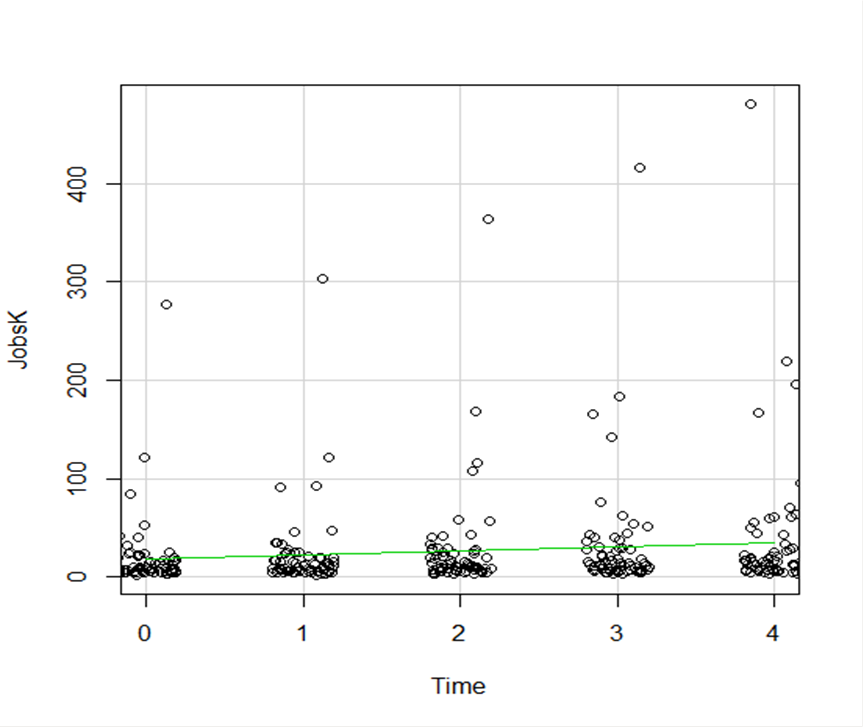
Let’s start with a simple scatter plot between Time and the number of Jobs (in thousands) in 67 counties. Time is measured in decades since 1960.
The green line is the best fit linear regression line.
This wasn’t the default in R Commander (I actually had to remove a few things to get to this), but it’s a useful way to start out.
A few ways we can easily customize this graph:
Jittering
We see here a common issue in scatter plots–because the X values are discrete, the points are all on top of each other.
It’s difficult to tell just how many points there are at the bottom of the graph–it’s just a mass of black.
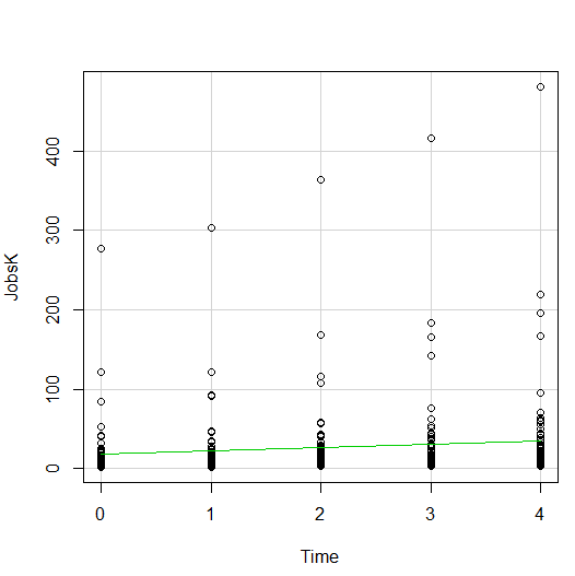
One great way to solve this is by jittering the points.
All this means is that instead of putting identical points right on top of each other, we move it slightly, randomly, in either one or both directions. In this example, I jittered only horizontally:
So while the points aren’t graphed exactly where they are, we can see the trends and we can now see how many points there are in each decade.
How hard is this to do in R Commander? One click:
Regression Lines by Group
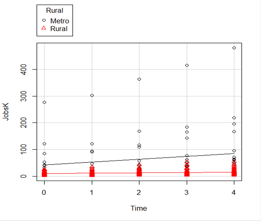
Another useful change to a scatter plot is to add a separate regression line to the graph based on some sort of factor in the data set.
In this example, the observations are measured for counties and each county is classified as being either Rural or Metropolitan.
If we’d like to see if the growth in jobs over time is different in Rural and Metropolitan counties, we need a separate line for each group.
In R Commander we can do this quite easily. Not only do we get two regression lines, but each point is clearly designated as being from either a Rural or Metropolitan county through its color and shape.
It’s quite clear that not only was there more growth in the number of jobs in Metro counties, there was almost no change at all in the Rural counties.
 And once again, how difficult is this? This time, two clicks.
There are quite a few modifications you can make just using the buttons, but of course, R Commander doesn’t do everything.
For example, I could not figure out how to change those red triangles to green rectangles through the menus.
But that’s the best part about R Commander. It works very much like the Paste button in SPSS.
Meaning, it creates the code for you. So I can take the code it created, then edit it to get my graph looking the way I want.
I don’t have to memorize which command creates a scatter plot.
I don’t have to memorize how to pull my SPSS data into R or tell R that Rural is a factor. I can do all that through R Commander, then just look up the option to change the color and shape of the red triangles.
I received a question recently about R Commander, a free R package.
R Commander overlays a menu-based interface to R, so just like SPSS or JMP, you can run analyses using menus. Nice, huh?
The question was whether R Commander does everything R does, or just a small subset.
Unfortunately, R Commander can’t do everything R does. Not even close.
But it does a lot. More than just the basics.
So I thought I would show you some of the things R Commander can do entirely through menus–no programming required, just so you can see just how unbelievably useful it is.
Since R commander is a free R package, it can be installed easily through R! Just type install.packages("Rcmdr") in the command line the first time you use it, then type library("Rcmdr") each time you want to launch the menus.
Data Sets and Variables
Import data sets from other software:
- SPSS
- Stata
- Excel
- Minitab
- Text
- SAS Xport
Define Numerical Variables as categorical and label the values
Open the data sets that come with R packages
Merge Data Sets
Edit and show the data in a data spreadsheet
Personally, I think that if this was all R Commander did, it would be incredibly useful. These are the types of things I just cannot remember all the commands for, since I just don’t use R often enough.
Data Analysis
Yes, R Commander does many of the simple statistical tests you’d expect:
- Chi-square tests
- Paired and Independent Samples t-tests
- Tests of Proportions
- Common nonparametrics, like Friedman, Wilcoxon, and Kruskal-Wallis tests
- One-way ANOVA and simple linear regression
What is surprising though, is how many higher-level statistics and models it runs:
- Hierarchical and K-Means Cluster analysis (with 7 linkage methods and 4 options of distance measures)
- Principal Components and Factor Analysis
- Linear Regression (with model selection, influence statistics, and multicollinearity diagnostic options, among others)
- Logistic regression for binary, ordinal, and multinomial responses
- Generalized linear models, including Gamma and Poisson models
In other words–you can use R Commander to run in R most of the analyses that most researchers need.
Graphs
A sample of the types of graphs R Commander creates in R without you having to write any code:
- QQ Plots
- Scatter plots
- Histograms
- Box Plots
- Bar Charts
The nice part is that it does not only do simple versions of these plots. You can, for example, add regression lines to a scatter plot or run histograms by a grouping factor.
If you’re ready to get started practicing, click here to learn about making scatterplots in R commander, or click here to learn how to use R commander to sample from a uniform distribution.
In my last couple of articles (Part 4, Part 5), I demonstrated a logistic regression model with binomial errors on binary data in R’s glm() function.
But one of wonderful things about glm() is that it is so flexible. It can run so much more than logistic regression models.
The flexibility, of course, also means that you have to tell it exactly which model you want to run, and how.
In fact, we can use generalized linear models to model count data as well.
In such data the errors may well be distributed non-normally and the variance usually increases with the mean values.
As with binary data, we use the glm() command, but this time we specify a Poisson error distribution and the logarithm as the link function.
The natural log is the default link function for the Poisson error distribution. It works well for count data as it forces all of the predicted values to be positive.
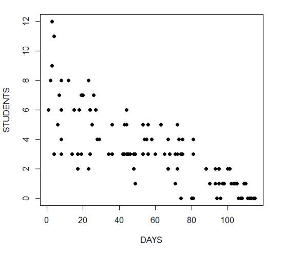
In the following example we fit a generalized linear model to count data using a Poisson error structure. The data set consists of counts of high school students diagnosed with an infectious disease within a period of days from an initial outbreak.
cases <-
structure(list(Days = c(1L, 2L, 3L, 3L, 4L, 4L, 4L, 6L, 7L, 8L,
8L, 8L, 8L, 12L, 14L, 15L, 17L, 17L, 17L, 18L, 19L, 19L, 20L,
23L, 23L, 23L, 24L, 24L, 25L, 26L, 27L, 28L, 29L, 34L, 36L, 36L,
42L, 42L, 43L, 43L, 44L, 44L, 44L, 44L, 45L, 46L, 48L, 48L, 49L,
49L, 53L, 53L, 53L, 54L, 55L, 56L, 56L, 58L, 60L, 63L, 65L, 67L,
67L, 68L, 71L, 71L, 72L, 72L, 72L, 73L, 74L, 74L, 74L, 75L, 75L,
80L, 81L, 81L, 81L, 81L, 88L, 88L, 90L, 93L, 93L, 94L, 95L, 95L,
95L, 96L, 96L, 97L, 98L, 100L, 101L, 102L, 103L, 104L, 105L,
106L, 107L, 108L, 109L, 110L, 111L, 112L, 113L, 114L, 115L),
    Students = c(6L, 8L, 12L, 9L, 3L, 3L, 11L, 5L, 7L, 3L, 8L,
    4L, 6L, 8L, 3L, 6L, 3L, 2L, 2L, 6L, 3L, 7L, 7L, 2L, 2L, 8L,
    3L, 6L, 5L, 7L, 6L, 4L, 4L, 3L, 3L, 5L, 3L, 3L, 3L, 5L, 3L,
    5L, 6L, 3L, 3L, 3L, 3L, 2L, 3L, 1L, 3L, 3L, 5L, 4L, 4L, 3L,
    5L, 4L, 3L, 5L, 3L, 4L, 2L, 3L, 3L, 1L, 3L, 2L, 5L, 4L, 3L,
    0L, 3L, 3L, 4L, 0L, 3L, 3L, 4L, 0L, 2L, 2L, 1L, 1L, 2L, 0L,
    2L, 1L, 1L, 0L, 0L, 1L, 1L, 2L, 2L, 1L, 1L, 1L, 1L, 0L, 0L,
    0L, 1L, 1L, 0L, 0L, 0L, 0L, 0L)), .Names = c("Days", "Students"
), class = "data.frame", row.names = c(NA, -109L))

attach(cases)

head(cases)
    Days Students
1    1      6
2    2      8
3    3     12
4    3      9
5    4      3
6    4      3
The mean and variance are different (actually, the variance is greater). Now we plot the data.
plot(Days, Students, xlab = "DAYS", ylab = "STUDENTS", pch = 16)
Now we fit the glm, specifying the Poisson distribution by including it as the second argument.
model1 <- glm(Students ~ Days, poisson) summary(model1) Call: glm(formula = Students ~ Days, family = poisson) Deviance Residuals: Min 1Q Median 3Q Max -2.00482 -0.85719 -0.09331 0.63969 1.73696 Coefficients: Estimate Std. Error z value Pr(>|z|)
(Intercept)  1.990235   0.083935   23.71   <2e-16 ***
Days        -0.017463   0.001727  -10.11   <2e-16 ***
---
Signif. codes:  0 ‘***’ 0.001 ‘**’ 0.01 ‘*’ 0.05 ‘.’ 0.1 ‘ ’ 1

(Dispersion parameter for poisson family taken to be 1)

    Null deviance: 215.36  on 108  degrees of freedom
Residual deviance: 101.17  on 107  degrees of freedom
AIC: 393.11

Number of Fisher Scoring iterations: 5
The negative coefficient for Days indicates that as days increase, the mean number of students with the disease is smaller.
This coefficient is highly significant (p < 2e-16).
We also see that the residual deviance is greater than the degrees of freedom, so that we have over-dispersion. This means that there is extra variance not accounted for by the model or by the error structure.
This is a very important model assumption, so in my next article we will re-fit the model using quasi poisson errors.
****
See our full R Tutorial Series and other blog posts regarding R programming.
About the Author: David Lillis has taught R to many researchers and statisticians. His company, Sigma Statistics and Research Limited, provides both on-line instruction and face-to-face workshops on R, and coding services in R. David holds a doctorate in applied statistics.
In my last post I used the glm() command in R to fit a logistic model with binomial errors to investigate the relationships between the numeracy and anxiety scores and their eventual success.
Now we will create a plot for each predictor. This can be very helpful for helping us understand the effect of each predictor on the probability of a 1 response on our dependent variable.
We wish to plot each predictor separately, so first we fit a separate model for each predictor. This isn’t the only way to do it, but one that I find especially helpful for deciding which variables should be entered as predictors.
model_numeracy <- glm(success ~ numeracy, binomial)
 summary(model_numeracy)
Call:
glm(formula = success ~ numeracy, family = binomial)

Deviance Residuals:
   Min       1Q   Median       3Q     Max
-1.5814 -0.9060   0.3207   0.6652   1.8266

Coefficients:
           Estimate Std. Error z value Pr(>|z|)
(Intercept) -6.1414     1.8873 -3.254 0.001138 **
numeracy     0.6243     0.1855   3.366 0.000763 ***
---
Signif. codes: 0 ‘***’ 0.001 ‘**’ 0.01 ‘*’ 0.05 ‘.’ 0.1 ‘ ’ 1

(Dispersion parameter for binomial family taken to be 1)

   Null deviance: 68.029 on 49 degrees of freedom
Residual deviance: 50.291 on 48 degrees of freedom
AIC: 54.291

Number of Fisher Scoring iterations: 5
We do the same for anxiety.
model_anxiety <- glm(success ~ anxiety, binomial)

summary(model_anxiety)
Call:
glm(formula = success ~ anxiety, family = binomial)

Deviance Residuals:
   Min       1Q   Median       3Q     Max
-1.8680 -0.3582   0.1159   0.6309   1.5698

Coefficients:
           Estimate Std. Error z value Pr(>|z|)
(Intercept) 19.5819     5.6754   3.450 0.000560 ***
anxiety     -1.3556    0.3973 -3.412 0.000646 ***
---
Signif. codes: 0 ‘***’ 0.001 ‘**’ 0.01 ‘*’ 0.05 ‘.’ 0.1 ‘ ’ 1

(Dispersion parameter for binomial family taken to be 1)

   Null deviance: 68.029 on 49 degrees of freedom
Residual deviance: 36.374 on 48 degrees of freedom
AIC: 40.374

Number of Fisher Scoring iterations: 6
Now we create our plots. First we set up a sequence of length values which we will use to plot the fitted model. Let’s find the range of each variable.
range(numeracy)
 [1] 6.6 15.7

range(anxiety)
 [1] 10.1 17.7
Given the range of both numeracy and anxiety. A sequence from 0 to 15 is about right for plotting numeracy, while a range from 10 to 20 is good for plotting anxiety.
xnumeracy <-seq (0, 15, 0.01)

ynumeracy <- predict(model_numeracy, list(numeracy=xnumeracy),type="response")
Now we use the predict() function to set up the fitted values. The syntax type = “response” back-transforms from a linear logit model to the original scale of the observed data (i.e. binary).
plot(numeracy, success, pch = 16, xlab = "NUMERACY SCORE", ylab = "ADMISSION")

lines(xnumeracy, ynumeracy, col = "red", lwd = 2)
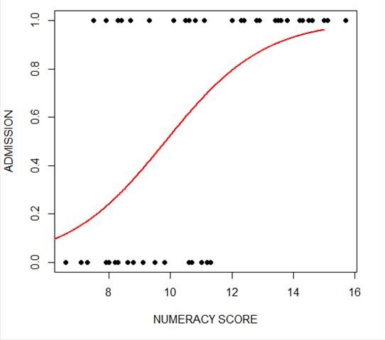 The model has produced a curve that indicates the probability that success = 1 to the numeracy score. Clearly, the higher the score, the more likely it is that the student will be accepted.
Now we plot for anxiety.
xanxiety <- seq(10, 20, 0.1)

yanxiety <- predict(model_anxiety, list(anxiety=xanxiety),type="response")

plot(anxiety, success, pch = 16, xlab = "ANXIETY SCORE", ylab = "SUCCESS")

lines(xanxiety, yanxiety, col= "blue", lwd = 2)
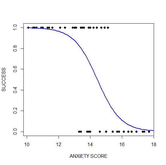 Clearly, those who score high on anxiety are unlikely to be admitted, possibly because their admissions test results are affected by their high level of anxiety.
****
See our full R Tutorial Series and other blog posts regarding R programming.
About the Author: David Lillis has taught R to many researchers and statisticians. His company, Sigma Statistics and Research Limited, provides both on-line instruction and face-to-face workshops on R, and coding services in R. David holds a doctorate in applied statistics.